 Aplas Docs
Styles
How a map is coloured and labelled — a map can carry many styles
A style decides how a map looks: what each asset is drawn as, what colour it takes, what is labelled, and what the background does. It is a separate layer over the map, so the same landscape can tell different stories to different audiences without duplicating anything.
Each style belongs to one map, and a map can carry as many styles as you need. A cloud-migration style, a risk style and a cost style can all sit over the same map, and you choose between them when you open or publish it. The assets and their positions do not move; only the paint changes.
Creating a style
Styles > New opens the style dialog:
- Name — what it will be called
- Map — the map this style dresses
- Source — Blank, From Template, or From File
- Dark or Light — the base the style is built on
Templates are grouped by Template Category — General, Architecture, Finance, LeanIX, Operations — and each shows a thumbnail and a description. Starter carries the base layers most styles want; others are built around a specific question, such as App Risk Rating, which highlights the risk rating of each application.
Data requirements
Choosing a template shows its Data requirements — the fields it needs, and whether your inventory has them:
Data requirements
  ✓ Risk Rating                          Risk Rating
  ✓ All template fields matched to your index
A template that expects a field you do not have tells you before you create the style, rather than rendering a map with nothing on it.
The style designer
A style is a stack of layers, drawn in order. The designer lists them on the left with the live map beside it, so every change is visible immediately.
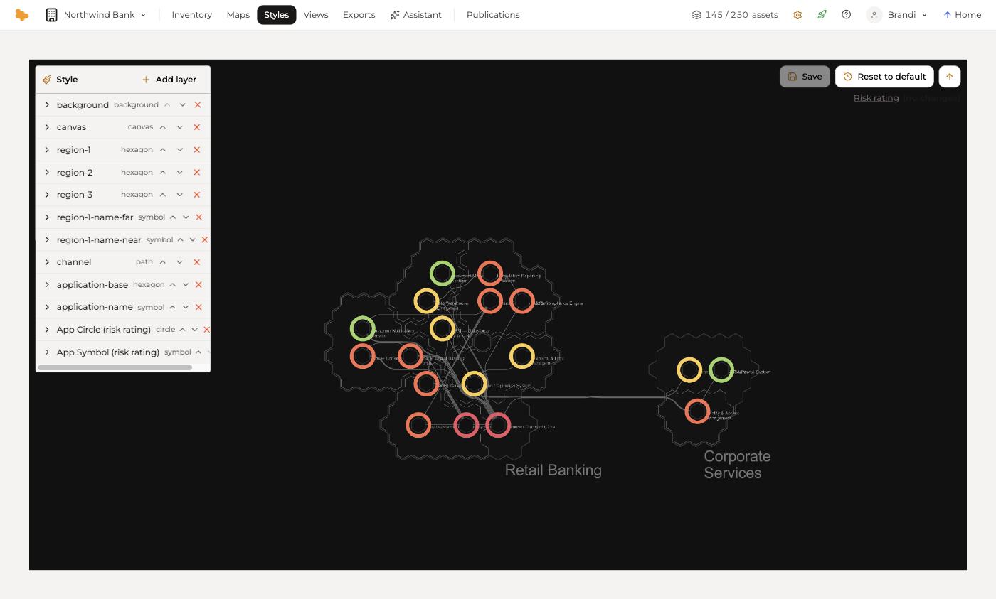
Each layer has a type, which decides what it draws:
| Layer type | Draws |
|---|---|
background | The area behind everything |
canvas | The map surface |
hexagon | Regions, and the base cell of an asset |
path | Channels — the lines between assets |
circle | A shape on an asset, such as a status ring |
symbol | Text — names and labels |
A style built from the App Risk Rating template, for example, carries base layers for the background, canvas, regions, region names, channels and application cells, then adds App Circle (risk rating) and App Symbol (risk rating) on top — the two layers that turn a risk field into visible colour.
Layers can be expanded to edit, reordered with the arrows, removed, and added to with + Add layer. Save commits your changes; Reset to default returns the style to the template it came from.
Styles and publishing
A published view keeps the style it was published with. Changing a style in the studio does not move a live publication — that keeps a shared URL stable while you work — and you republish when you want the audience to see the new version. See Publishing.