 Aplas Docs
Views
Every way of looking at your inventory — and why you no longer publish to see one
A view is one arrangement of your inventory: which assets it draws, how they are arranged, and how they are painted. The same assets can carry many views, and none of them copies the data — a view is a lens, not an extract.
Views in the studio nav is the home for every view except maps, which have their own section.
Render is not publish
Opening a view renders it, in the studio, immediately. You do not publish a view to look at it. Publishing is a separate, optional act that gives a view a URL and an audience — covered in Publishing.
What a new workspace starts with
A workspace arrives with a default view library rather than an empty page, grouped by shape:
| Group | View | Type |
|---|---|---|
| Tables | All assets | Table |
| Visualisations | Coverage matrix | Matrix |
| Visualisations | Dependency graph | Graph |
| Visualisations | Integration flow | Flow |
| Search | Search | Search |
The Type column is the badge each card wears.
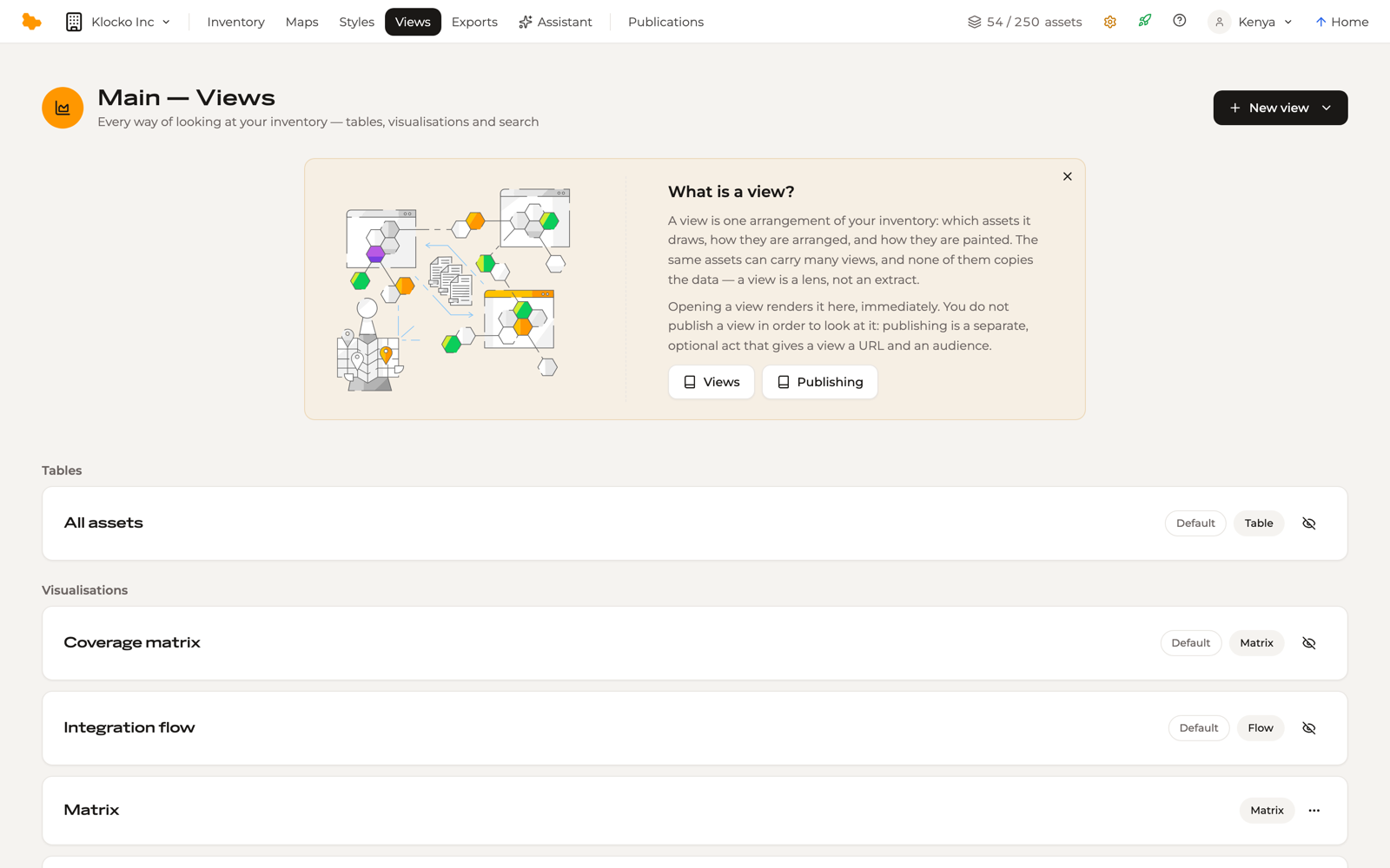
These are marked Default. They are ready to open and ready to publish, and acting on one turns it into a view of your own — publishing a default view makes it a real view, after which it behaves like any view you created.
+ New view creates a view of a chosen type.
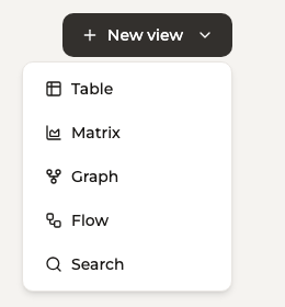
The view types
- Table — rows and columns, with the same sorting, filtering and column control as the Inventory grid
- Matrix — assets placed in cells by two fields. Choose the Type it draws, what forms the Rows and Columns, and what it is Coloured by. When an axis is a choice field, each header carries the colour its option was given
- Graph — assets as nodes and their relations as edges, laid out by connection rather than by position. Edges take the colour of their relationship type
- Flow — the relations between assets drawn as ribbons, left to right, in the Sankey shape. Ribbon width says how much travels each way; ribbon colour says what kind of connection it is. Detailed below
- Search — a query surface over the workspace, for finding rather than browsing
- Map — assets pinned to a stable grid. Maps have their own section; see Maps
A view's controls sit above its canvas, and changing them changes the view for everyone who opens it — a view is shared, not personal.
The Flow view
A graph shows you that things are connected. A Flow shows you how much — which systems are the trunks everything else feeds, and where a single integration carries the whole estate's traffic.
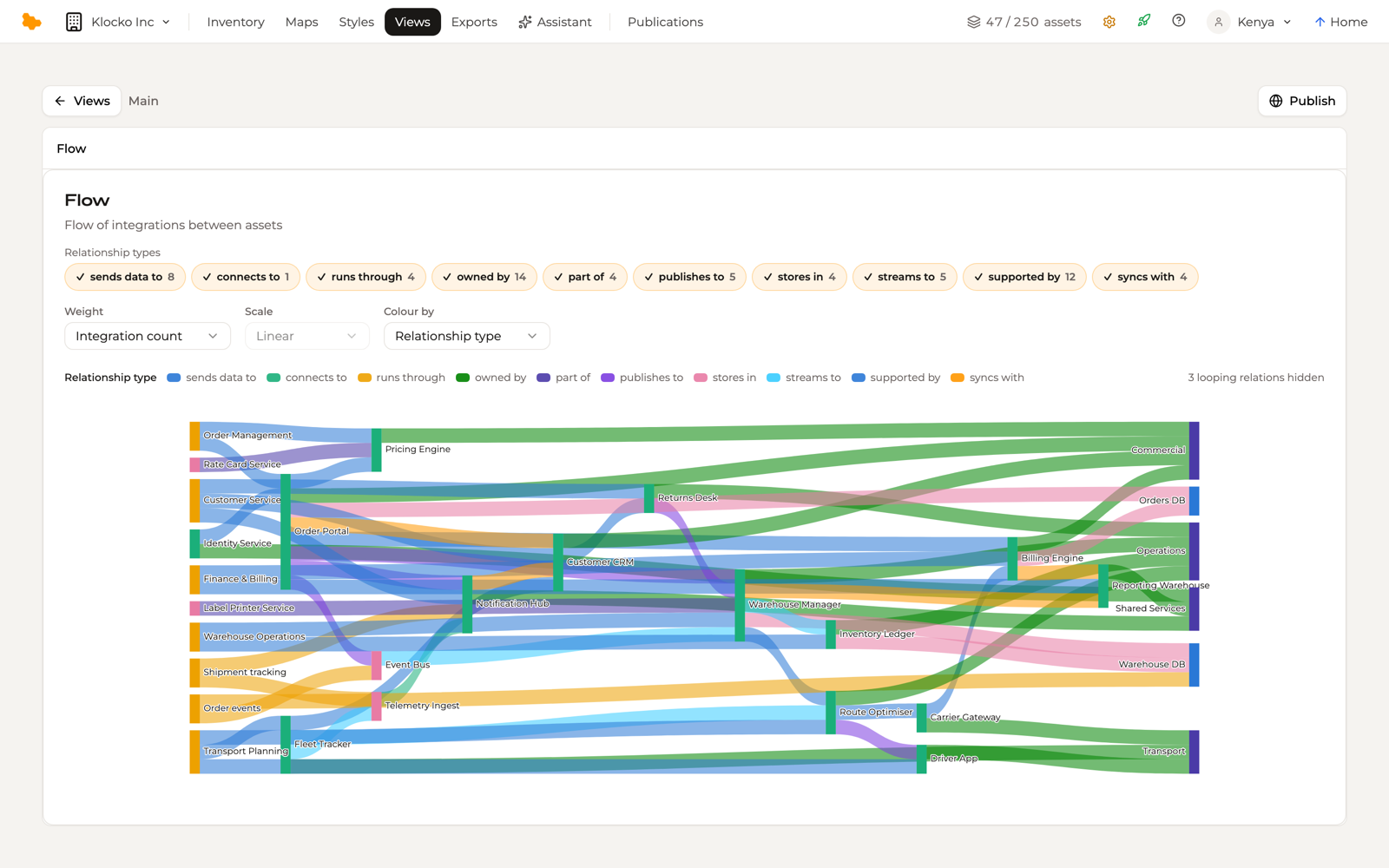
What it draws. Every relation in the workspace is a ribbon between the two assets it connects, and the assets are the bars the ribbons run between. An asset with no relations does not appear. Ribbons between the same pair that read the same colour merge into one, so two integrations from the orders service to the warehouse draw as a single ribbon twice the width — and clicking it lists both.
Ribbon width. Out of the box, width is a count: one unit per relation, so a thick ribbon means many integrations. Weight in the controls swaps the count for a numeric field on the connectivity records behind the ribbons — messages a day, cost, whatever your Integration type carries — and the ribbons re-size to its sums. Scale then sets how weight becomes thickness: Linear, Square root or Log. Linear is right for counts; a traffic figure that spans decades needs a square-root or log scale, or every ribbon but the trunk becomes a hairline.
Ribbon colour. By default ribbons take the colour of their relationship type, exactly as the graph's edges do, and the legend names the types on show. Colour by swaps that for a choice field on the connectivity records — a resilience rating, a data classification — and each option paints its ribbons in the colour you gave it. Relations with no value for that field draw in neutral grey, as Unset.
Scope. The relationship-type chips above the canvas — one per type present, with its count — narrow the flow to the verbs you care about; a map view's Relations layer uses the same chips. A Flow scoped to "sends data to" and weighted by volume is a data-flow diagram; the same view scoped to "depends on" is a dependency ladder.
Reading it. Hover a bar or a ribbon and everything upstream and downstream of it lights up. Click a ribbon and its inspector lists the connectivity records travelling it, each a link into the inventory. Click a bar to select the asset and hold its trace. A flow reads left to right, so a relation that would loop back cannot be drawn — the canvas says how many it has hidden.
A workspace's default Integration flow is rebuilt from your schema each time it opens, unweighted and coloured by relationship type. Customize it to set a weight, a colour field or a scope, and it becomes a view of your own.
Saving a grid as a view
The Inventory grid and the table view are the same surface, so a grid you have filtered and arranged can be kept without rebuilding it. Views > Save as new view in the grid toolbar creates a table view carrying the current filters, columns and sort, and it lands here.
Customizing
Customize on a view opens its configuration — the source it draws from and the options its type offers. What you set becomes the view's own arrangement, and is what a viewer sees when the view is published.